Customize student portal branding
Last updated: August 28, 2026
Housing.Cloud lets you apply your institution's branding to the student portal. You can set a public title, upload logos, and adjust brand colors that appear throughout the portal. Branding applies only to your institution's student portal and does not impact the admin portal.
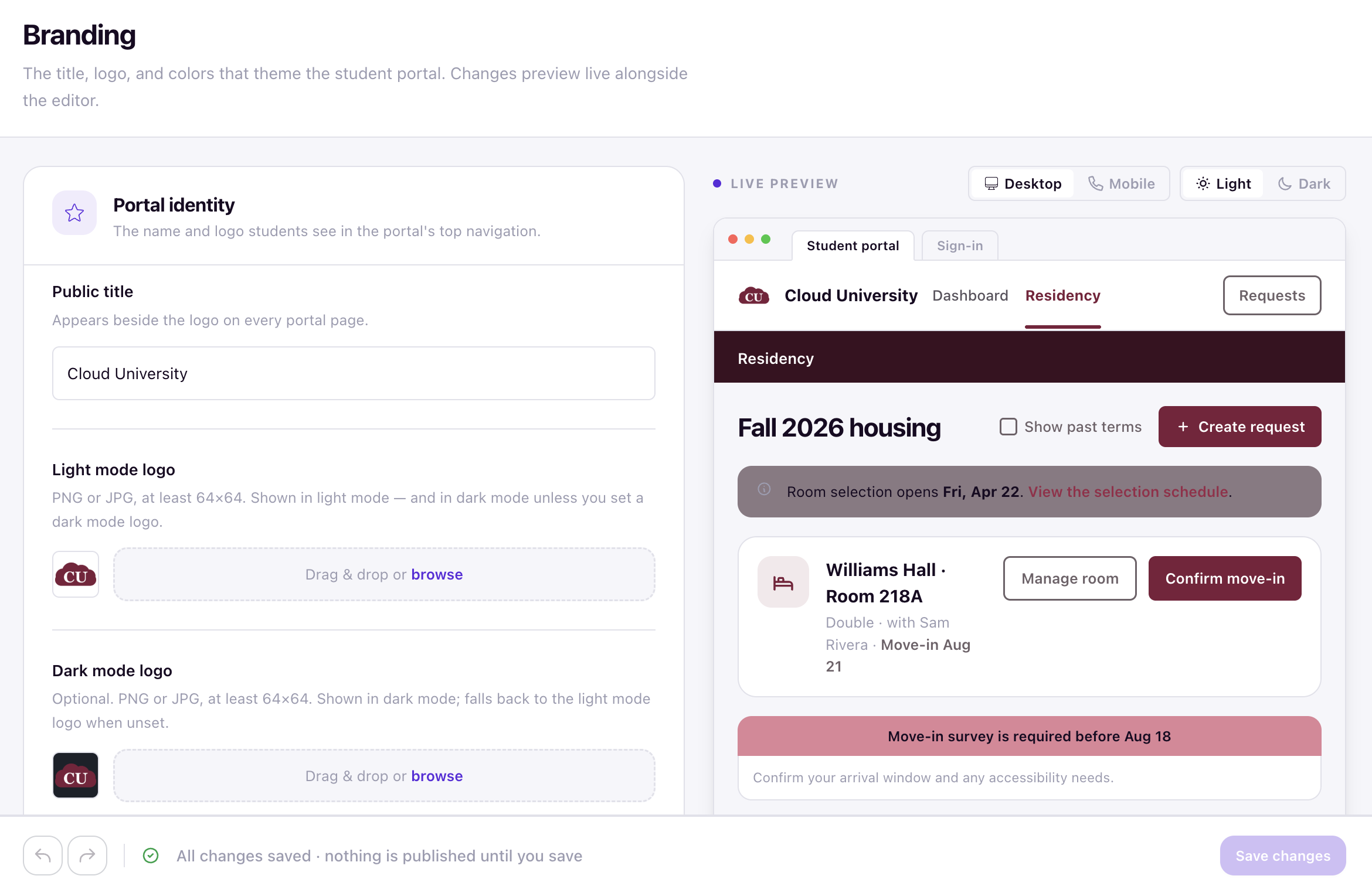
Changes are made from the Branding page under Setup > System Configuration. All updates preview live next to the editor, so you can see how students will experience the portal before saving.
Access the branding page
In the admin portal, open Setup > System Configuration > Branding. The page shows the branding editor on the left and a live preview on the right.
Update portal identity
The Portal identity section controls the title and logos that appear on every portal page.
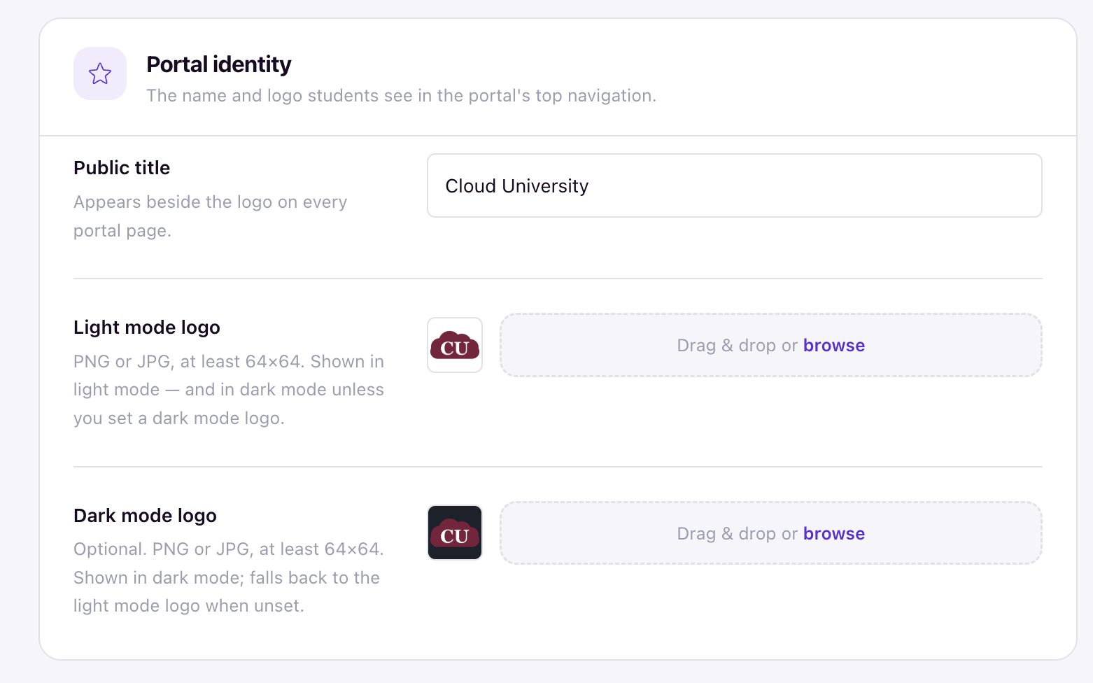
- In the Public title field, enter the name that appears beside the logo on every portal page. If you do not set a title, the portal defaults to Student Resident Life.
- In the Light mode logo field, upload a PNG or JPG that is at least 64×64. This logo is shown in light mode and is also used in dark mode unless you upload a separate dark mode logo.
- In the Dark mode logo field (Optional), upload a PNG or JPG that is at least 64×64. This is shown when a student is using dark mode. If you do not upload a dark mode logo, the light mode logo is used instead. If no logo is uploaded at all, the portal falls back to the Housing.Cloud default logo.
Customize brand colors
The Brand colors section lets you override the default portal color scheme. Colors are organized in a table with three columns: Color, Light mode, and Dark mode.
For each color token, enter a hex color value for light mode and dark mode.
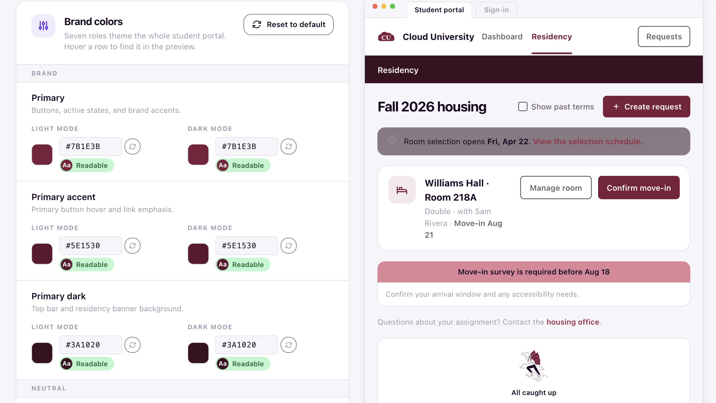
Hover any row to highlight where that color token appears in the live preview. You can also click Reset to default to restore a single color to its system default.
Preview your branding
The Live preview rail on the page shows how the student portal will look with your current settings. Use the Desktop and Mobile toggles to switch viewports, and the Light and Dark toggles to switch display modes.
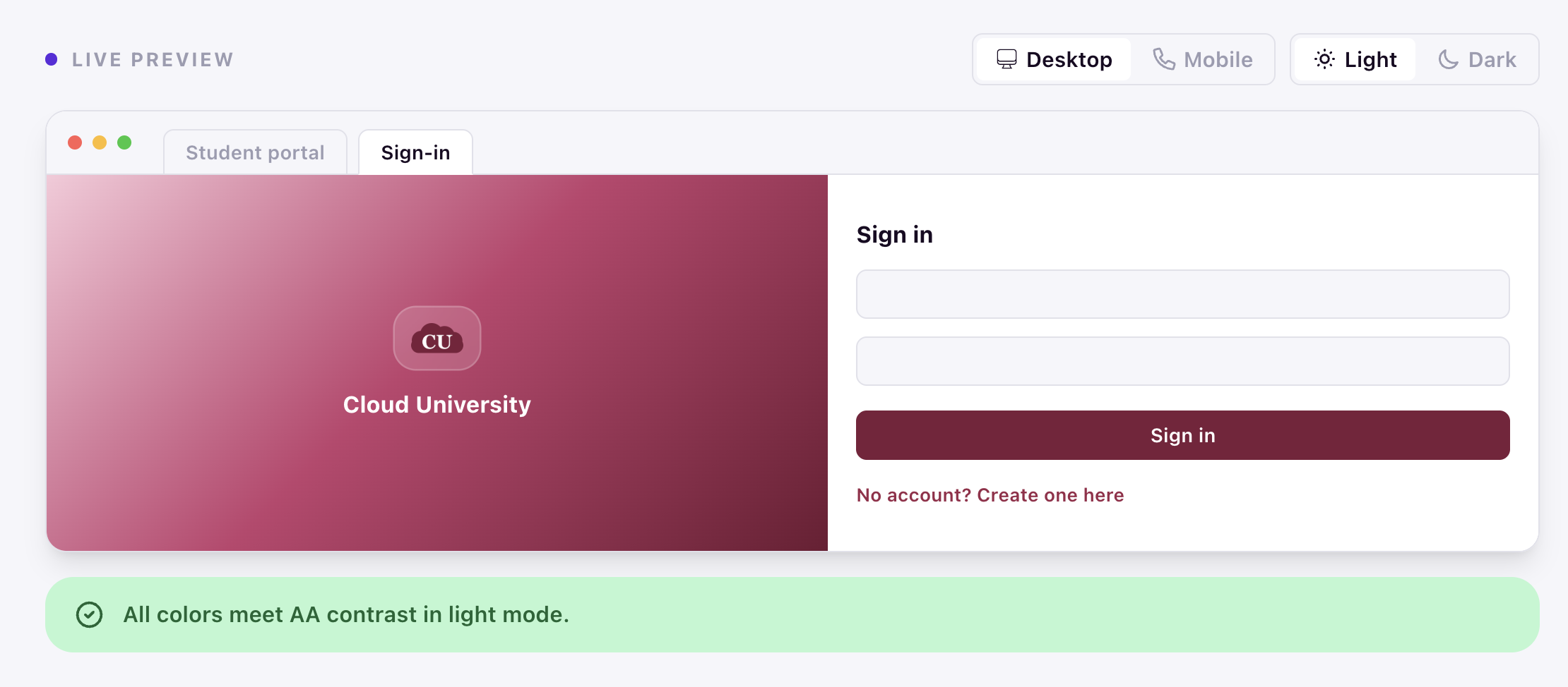
As you adjust colors, the preview updates in real time. An accessibility summary below the preview indicates whether your color combinations meet contrast standards in the selected mode. When you are ready to publish, click Save changes. The status line reads All changes saved when no unpublished edits remain.
Where branding appears in the student portal
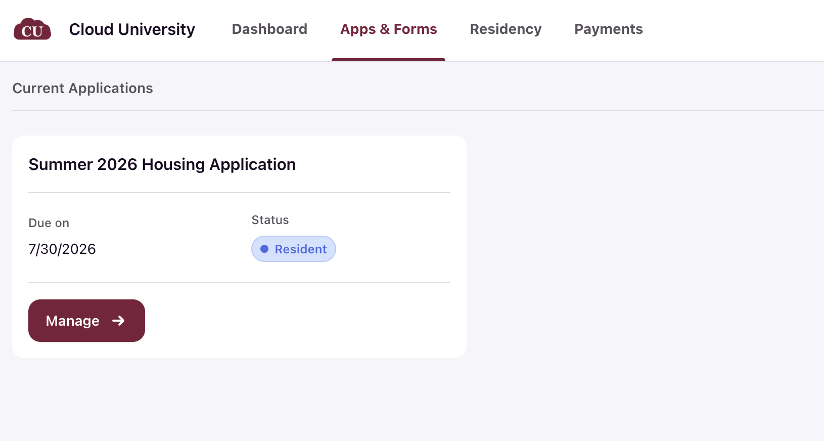
Once saved, your branding is applied to the respective student portal elements.
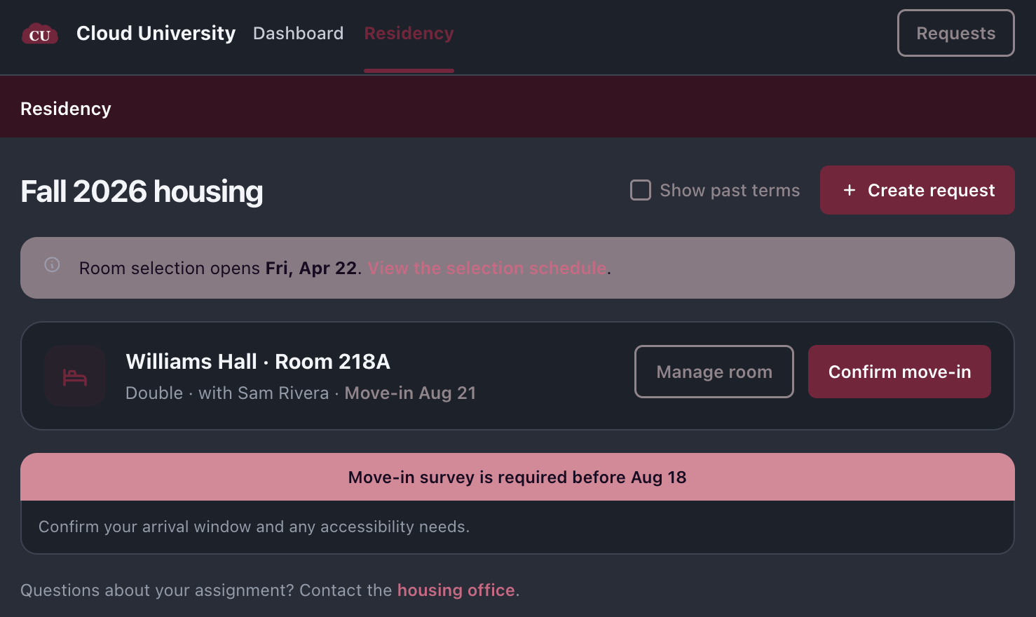
Verify your changes
After saving, open the student portal to confirm that the title, logo, and colors appear as expected. If a color is left blank, the Housing.Cloud default remains in effect for that token.